Alexa Mobile App
Alexa+ Privacy Dashboard
Visual and UX Refinement
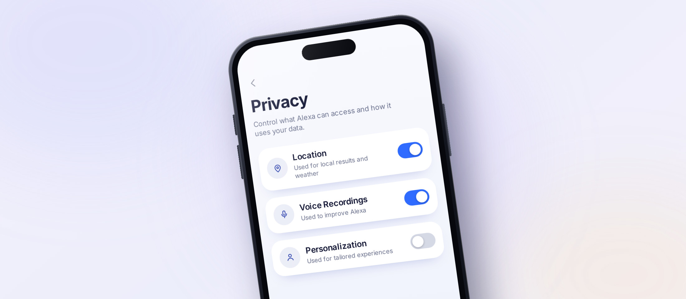
The Activity History page was a dense, text-heavy web view forced into the mobile app that was hard to scan or manage by touch.
A native, mobile-first settings experience: one unified feed, sub-pages for context, and legal language surfaced progressively.
A 40% reduction in visible on-screen text in pre-launch testing.
Problem
Alexa users needed a clearer way to review and manage their interaction history, but the existing Activity History Page was a web-view experience forced into a React native mobile app. As a web-view, the content in this experience was not built for a mobile-first viewport, meaning text was densely packed, content was difficult to scan, and the experience was poorly optimized for touch.
Users struggled to:
- Find specific interactions and settings (smart home, chat history)
- Understand what information Alexa collected and when
- Delete or manage history efficiently
At the same time, the experience had to meet strict legal and compliance requirements, limiting how much content could be removed or simplified.
Solution
The goal was to create a mobile-first Alexa Settings experience that improves clarity and control without compromising legal obligations, and allowed customers to clearly view and edit their privacy preferences.
We redesigned Alexa’s Privacy Dashboard into a fully native mobile experience centered on:
- A unified interaction settings feed
- Limited to relevant explanations for Alexa’s different types of settings
- Condensed, compliant legal language surfaced progressively
This approach preserved required disclosures while making settings review understandable and actionable.
Research and Insights
Customer insights came through Task-based User testing and Competitive analysis.
This revealed these consistent needs:
For example, “You may withdraw consent at any time…” became “Change consent anytime.”
These insights guided a design strategy focused on visual hierarchy, reduced text, and contextual clarity.
Main Design Problems
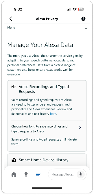
Manage Your Data - Webview
-
1
Built in web view and doesn’t use Mobile components
-
2
Fragmented & Incomplete - Some settings are missing
-
3
Dense & hard to parse, everything is shown at once
-
4
Menu and logos seem unnecessary
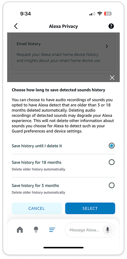
Sub-page format
-
1
Content is housed in a temporary bottom sheet-like format
-
2
Wording is ambiguous, repetitive, and misleading
-
3
Components do not reflect Alexa app branding or patterns
Design and Impact
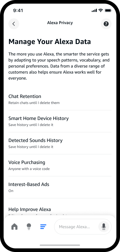
This view has been launched! Check out the Alexa app
The final experience was built around a single, scrollable settings page. Previously each setting category appeared as a card with dense content including a title, icon, summary, and current selection which made it difficult to parse. We edited this to resemble a quick-view, only displaying title and current selection for a cleaner look.
Tapping opens a sub-page to reveal full context, instead of a bottom-sheet format. This allows adequate space and attention to each setting.
Legal compliance was preserved through progressive disclosure. Required copy was moved into expandable tooltips and modals, reducing visual clutter while maintaining full transparency.
Pre-launch testing and stakeholder reviews showed:
Reach out for more!