Amazon Alexa Tablets
Out of Box Experience
Design Strategy and Systems Thinking
Launched
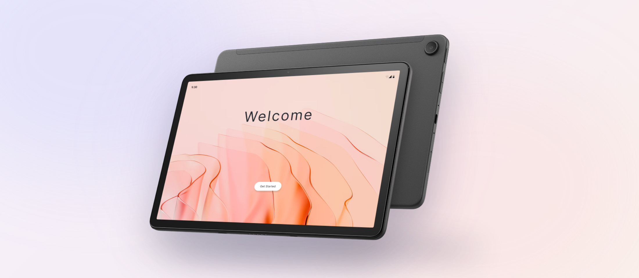
The move to Android put two setup systems into one flow: 50+ text-heavy screens and over 15 minutes.
One flow built around the customer's mental model, with visuals doing the work text used to do.
Up to 65% fewer screens, with higher completion rates and subscription conversion in beta testing.
Introduction
Out of the Box Experience is a customer's first real moment with a new device. For Amazon's new Alexa Tablets, moving from Fire OS to Android meant setup had functionality from two different systems coming to one flow.
What started as a visual refresh became a full overhaul of interaction, visual patterns, and systems that required delivery in 3 months with me as the sole product designer.
At launch, the tablets were described as having "seamless integration of Amazon services right out of the box." This flow is where that happens.
Problem
50+ screens among two backend systems combining into one flow. The challenge was navigating visual, textual, and technical density all at the same time including:
- A flow built around what the backend needed, not what customers understood
- Two sign-ins, Amazon and Google, with no clear reason why
- Walls of text that customers tapped past without absorbing
- Setup time grew from 6–7 minutes to 15–20 minutes
- Two visual systems needed to merge, with non-negotiable Android layout rules
Audit first, then redesign
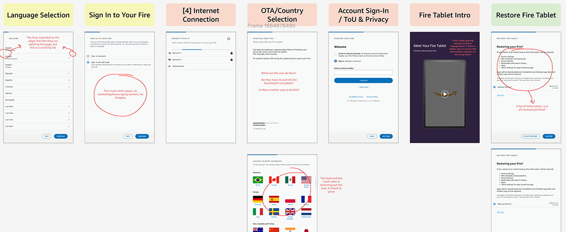
UX audit of the existing flow
I combed through the existing flow to identify dense language, unclear placement of screens, unnecessary imagery, and what legal protected and what could actually be removed.
Competitor audit
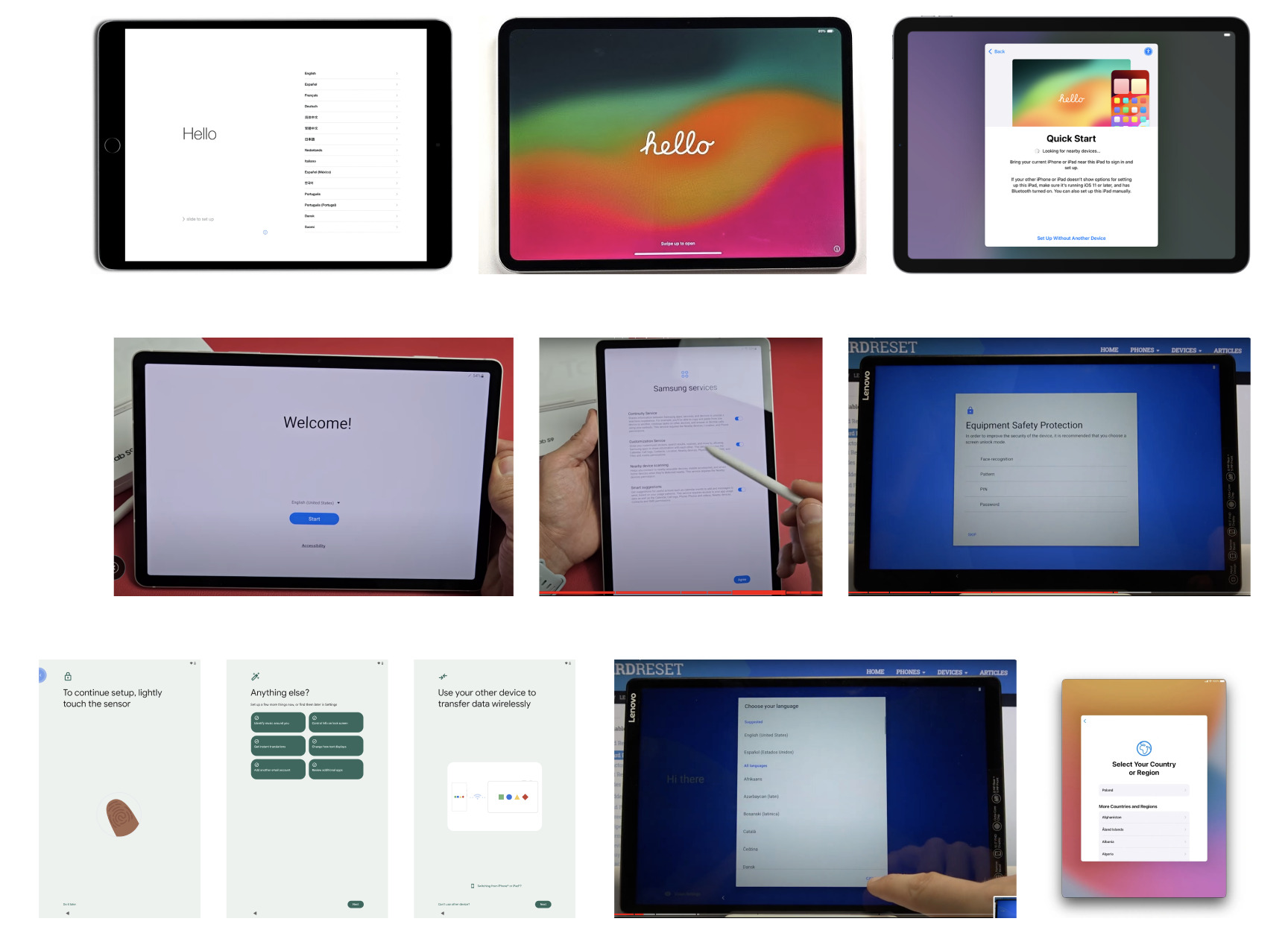
I also looked at similar onboarding processes from our competitors like Apple, Samsung, Google and Lenovo. They all followed the same pattern:
- One message per screen
- Progressive disclosure
- Visuals doing the work that we were using extra text to do
That led to three tenets behind every decision:
-
1
Consolidate steps that share a logical relationship
-
2
Order processes by the customer's mental model not the system's
-
3
Earn attention with visuals before using text for the same
Every screen had an owner
Almost every screen belonged to a different team. My job was to turn their separate requirements, limitations, and guidelines into a consistent flow.
-
Account Management:
Sign-in had very specific layouts and a pre-defined flow used across all Amazon services. -
Data Transfer:
We got Quick Start from Android, a process to easily restore data from previous android-based devices but this didn't work with FireOS; which had its own flow. -
Alexa, Appstore, Marketing:
Each team had their own needs for functionality like agent interaction, downloading and restoring apps, and marketing new features while setting up. -
Legal:
Every screen had to go through a legal check. -
Google:
Android layouts and some page ownership, in addition to Amazon page ownership.
I learned what each team truly needed and what was flexible, and used that map for every cut and reorder.
The work behind the work
Five design problems shaped the new flow: customer-forward interface rather than system-forward, easy data management, reducing redundancy, cleaning visuals, and reducing set-up time. I started with reordering based on what made sense for the customer, then collecting data, permissions, etc. that the system needed.
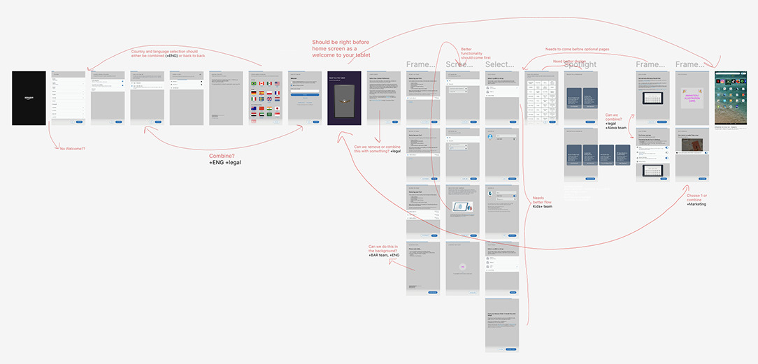 Re-ordering the original OOBE flow
Once I reordered the existing flow, I added the Google-owned screens to understand the overall complexity and redundancy in the flow, and eventually cut it down to the most intuitive, necessary, and quick flow.
As part of this process, I worked around 5 main modules of the flow involving different teams for each specific flow: Data restore, Account Management, Kids+, Marketing and Strategy, Legal, and more.
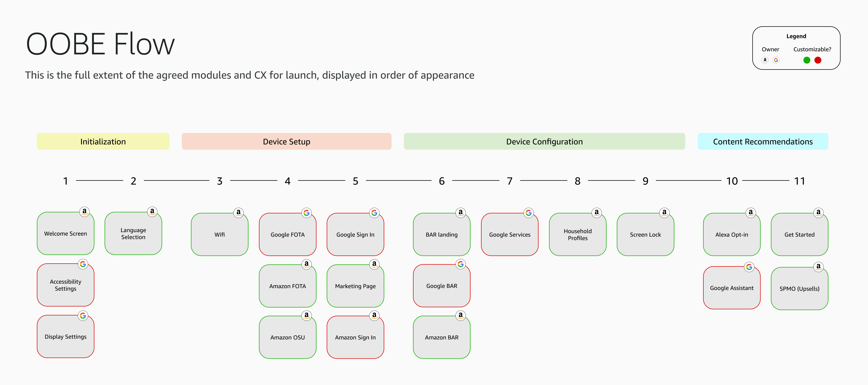 New flow with all required screens, tagged with ownership and ability to customize
1. Data transfer: four paths to restore
Problem: Android's Quick Start didn't work for customers coming from Fire tablets or Kindle, and each source needed a different backend route. Each device restore path had redundant actions and relied on the customer's in-depth knowledge about exactly which device or backup they want to use. This put too much pressure on the user about their next actions and by the time they realized, they'd already be too deep into the flow so no easy exit route.
What I did: I mapped every route with engineering and product, and based on the processes I combined four paths into one simple landing page. This allowed customers to see all their options at once and an easy way out, and reduced the burden of knowing exactly where or what device/backup to use.
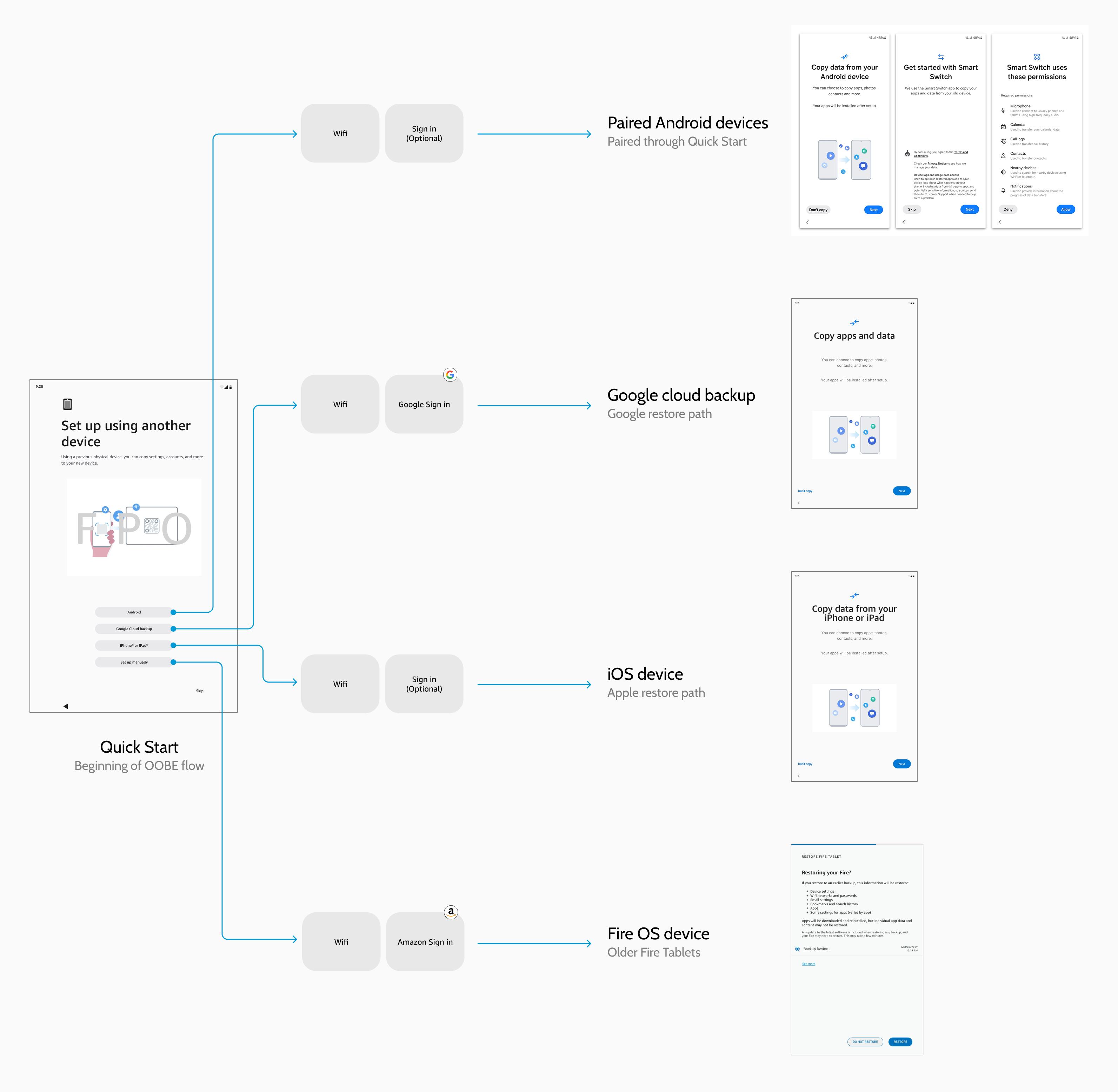
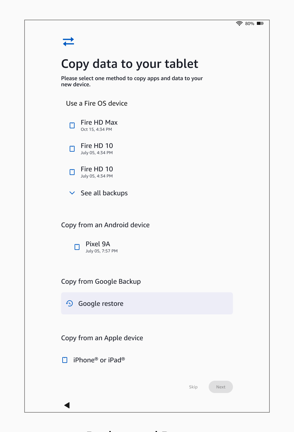
Leadership call: Leadership preferred a restore approach that kept legacy branding, but it added time and buried new platform features. It also added technical complexity to re-route and combine flows that didn't originally go together. I compared 4 options on:
- Information density
- Technical feasibility
- Flow complexity
- Cross-platform consistency
With engineering and product teams explaining the backend complexity and product identity issues, and my presentation of the poor interaction and strategy analysis, we were able to get VP-level (L10) leadership on board with a simpler CX. The result was a hybrid solution that didn't exist before that presentation, and combined all 4 paths into one.
2. Two account sign-ins
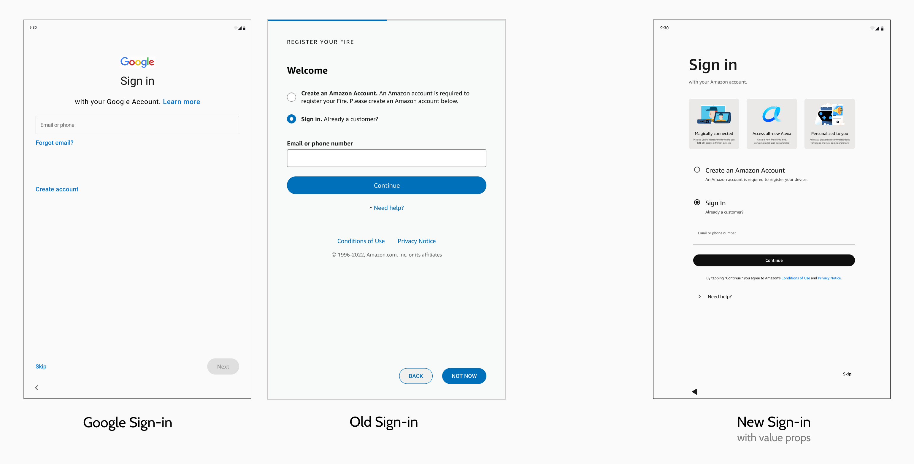
Problem: To achieve full Tablet functionality, customers needed to sign-in to both Amazon and Google accounts, but were more likely to sign into what came first (Google) and skip Amazon. This put our customization features, Alexa functionality, and 1P apps at risk of not being used. We had a welcome video that emphasized our various value props to customers but being placed away and not immediately next to the sign-in page caused a drop in engagement.
What I did: Made the case to engineering for a change in approach, not just reordering screens but product education and marketing. I worked with accounts, marketing and legal teams to re-design the Amazon sign-in page and draw attention to our clear value props. This allowed customers to understand what they would be missing if they skipped signing into Amazon, and hopefully retain engagement.
This shows the design at handoff. The imagery was refined further before launch.
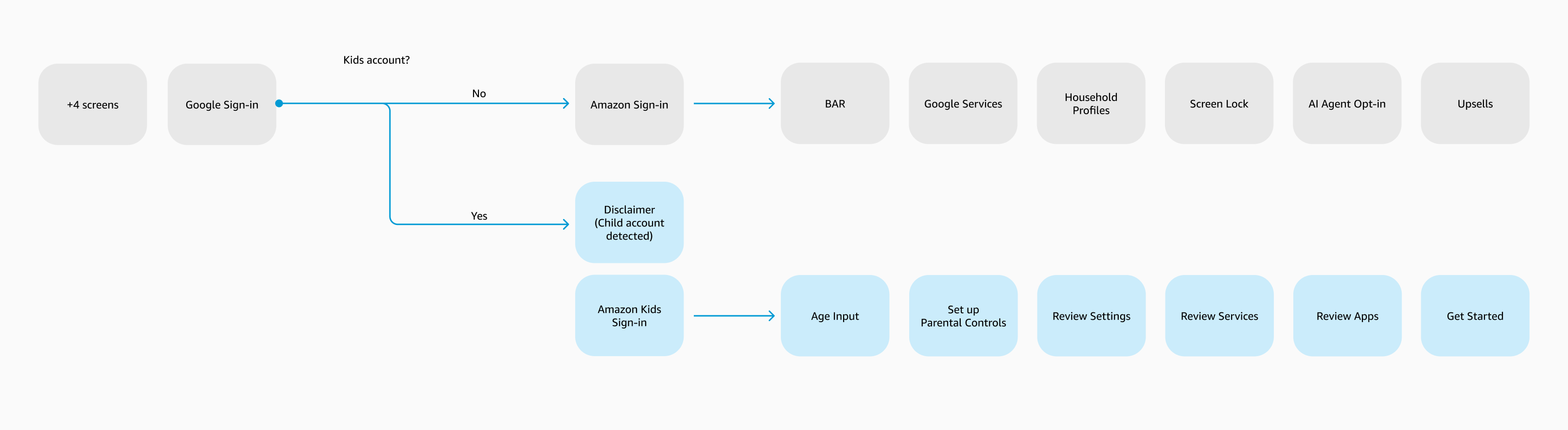
3. A separate path for kids
Problem: Kids accounts needed an adult to supervise, and half the adult screens didn't apply or were age protected. The flow broke in several places.
What I did: I worked with the Kids+ team to fork the flow after sign-in, so Kids+ customers could have a smooth set up and see content catered to them.
4. Choosing the default assistant
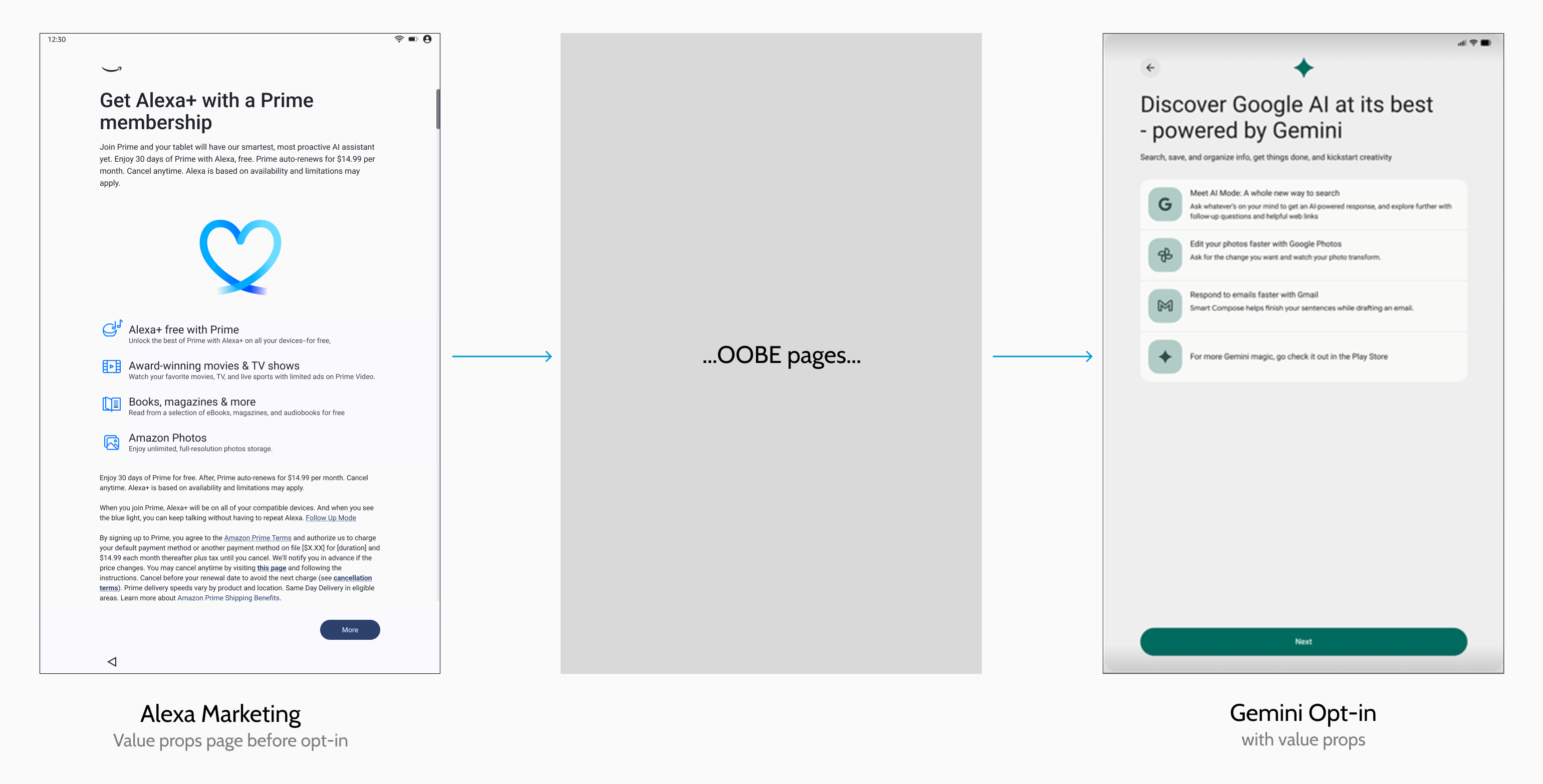
Problem: Amazon wanted Alexa as the default on its hardware. Google wanted Gemini on its OS.
What I did: Worked across product, marketing and legal on re-arranging screen order and building value prop screens for Alexa+. This also involved a lot of product strategy negotiation. In the end, the tablet kept Alexa, each assistant has its own moment to engage the customer, and the customer can choose their default during setup.
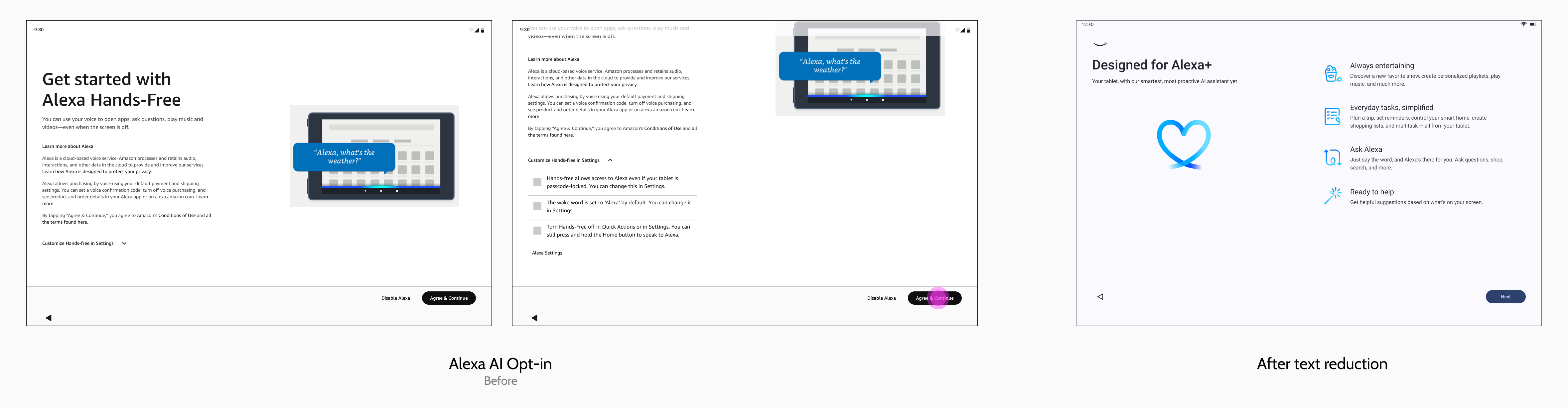
5. Legal on every screen
Problem: Cutting text couldn't cost legal accuracy, and some disclaimers had to sit above the fold where Android's visual layouts made it difficult to fit our large amount of text.
What I did: Worked with legal to shorten, reword or move language, and redesigned pages that couldn't meet both needs.
A new visual pattern, not just a new flow
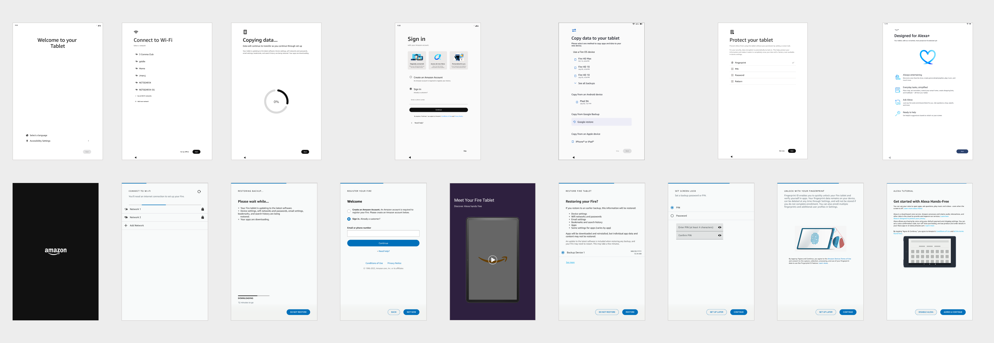
This flow is now shipping on the new Amazon Alexa Tablet 8, 11 and 12 Pro, with 50+ screens cut to 15–20.
The new flow adds Google sign-in, Quick Start data restore, more in-context marketing and engagement, a kids path, and a choice of default assistant. With so many teams and stakeholders involved and to keep track of, staying organized was extremely important. I created new formats to double check visual content with our design systems, branding, and legal teams so they could see when things were updated in real-time and make changes async, saving all of us time. I also organized specs to standardize the design-to-development handoff format, which became a standard pattern across the Tablets org.
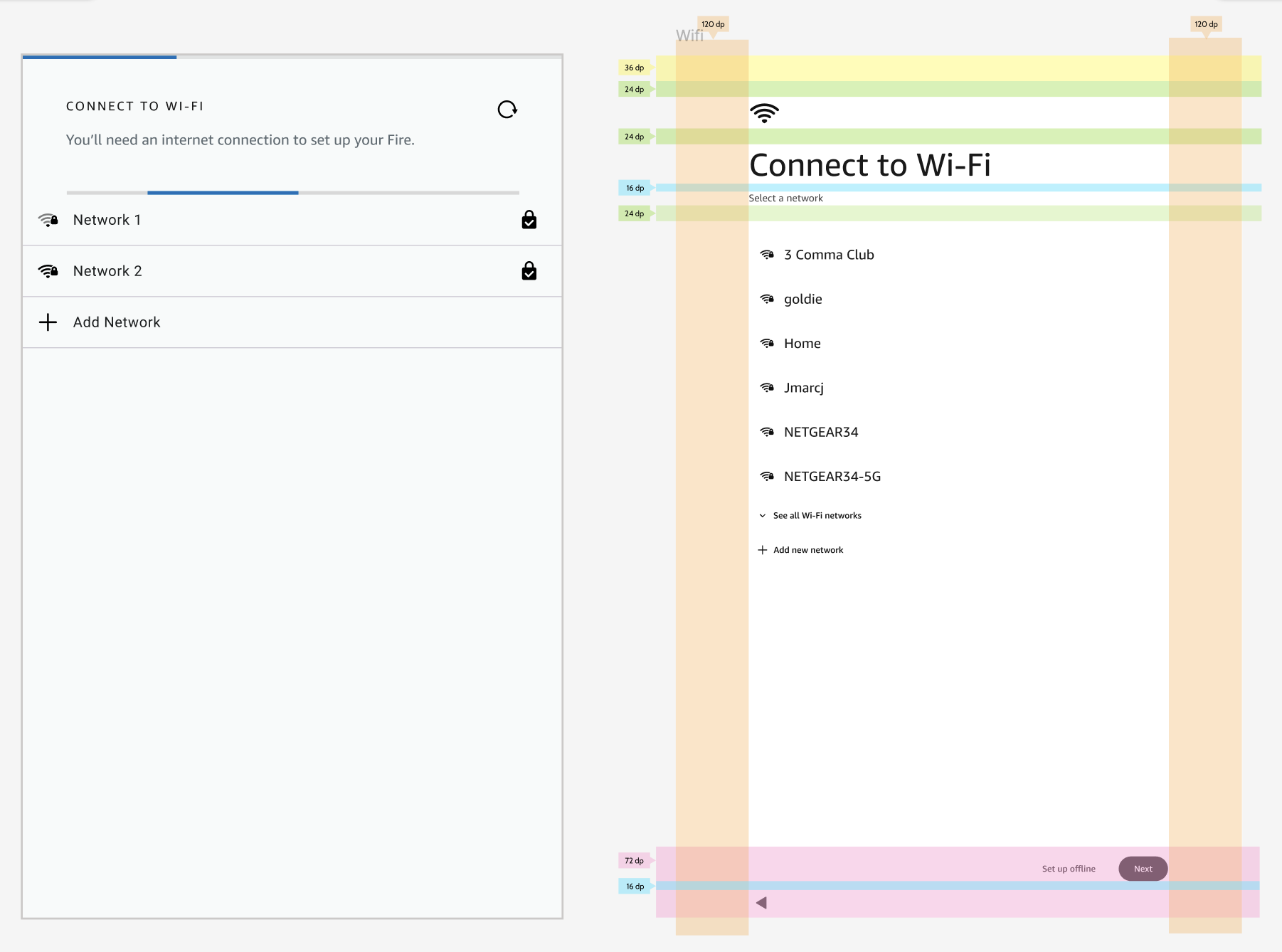
A new visual system
The Android system had set strict rules for which system owned each page and how every layout worked across screen sizes. Every page was rebuilt to cater to these rules, which is why the final screens look so different from the original flow. With a whole new design system and visual format, visual design, branding, and UX teams had to work very closely together, very often to make sure nothing fell through the cracks when we moved fast. This is where my handoff format came in handy and helped everyone approve and move faster.
Final Screens
Impact
Some internal details are confidential.
Reach out for more!