Alexa+ Web
Deep Research
Turning a conversational assistant into a powerful research engine, without making it feel like a different product.
Pre-Launch
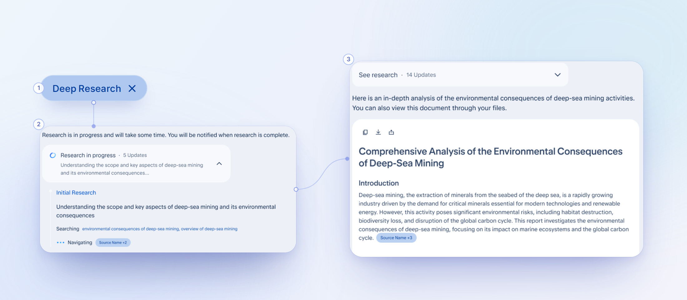
Alexa+ users wanted the ability to use Alexa for research beyond quick conversation, but the existing experience had limited capability for in-depth analysis.
A research mode that allows customers to generate a report, with a step-by-step process breakdown, and notifications that let users multi-task while the research happens.
Built for Alexa web and tested with customers. About 70% rated the report better than expected, and over 90% could watch the research happen. About 1 in 3 couldn't find the mode, so finding it is the focus of the next round.
Problem
Alexa+ users want to go deeper but product limitations didn't let them.
- NeedCustomers arrived with questions that needed real research, like planning a family trip, comparing products or understanding a diagnosis. The existing experience had limited capability for that depth.
- BriefBuild an Alexa+ version of Nova, Amazon's deep research model and our ceiling product set. Designs had to stay tethered to what the model could actually produce, but there was room to go further than Nova's structure and visuals.
- RequirementNo degradation of existing Alexa+ functionality in Deep Research mode, or when returning to prior sessions from any endpoint. The mode had to be fully additive.
About Nova
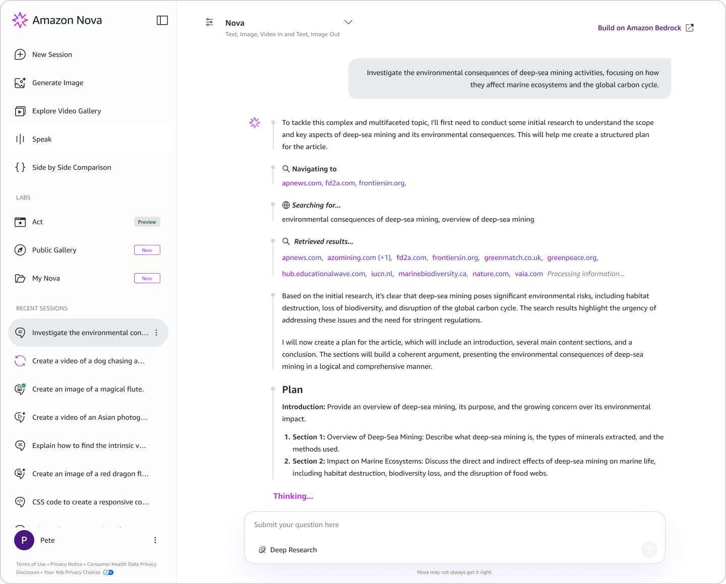
Nova is Amazon's internal research model, and it surfaces everything it produces.
- OutputDense, unfiltered content: every step, every source, and lots of explanatory text that needs extra verification and filtering.
- FitA more technical audience. Alexa's audience is a household user trying to plan a trip.
My contribution
-
1
Reduced text overload
Identifying what the user actually needs to see vs. what the model produces.
-
2
Mimic AI thinking
Organized the research process into sequential, readable, and purposeful information.
-
3
Surfacing and drawing attention to the goal
Made the agent process collapsible so the generated report is always the primary content, not the trace.
-
4
Build and maintain trust
Added inline citations and a sources panel so users can verify information without leaving the chat.
-
5
Latency masking and re-discovery
Brainstormed a structure (IA) for a multi-minute wait: notifications, badges, and progress indicators, so users can start a new chat and return when their response/report is ready.
-
6
Optimized the agent bar
Redesigned the agent input bar to carry status indicators for active modes, creating an extensible system for Deep Research, model selection, and future modes or features.
Not a demographic, but a moment
We didn’t define the target user by who they are, but by the moment they’re in. The moment when a conversation goes from simple back-and-forth to a question too complex for a quick answer and too time-consuming to research manually.
- ExamplesA parent comparing preschools, a first-time homebuyer, a student writing about a topic they don't understand yet.
- SpansHousehold productivity, health planning, financial decisions, travel, education and home improvement.
- Shared needComprehensive output they can act on, not a paragraph to skim.
- BasisUse cases came from product teams, based on general Alexa+ usage. Decisions were grounded in stakeholder input, the product requirements and competitive signals from the audit.
Competitor Audit
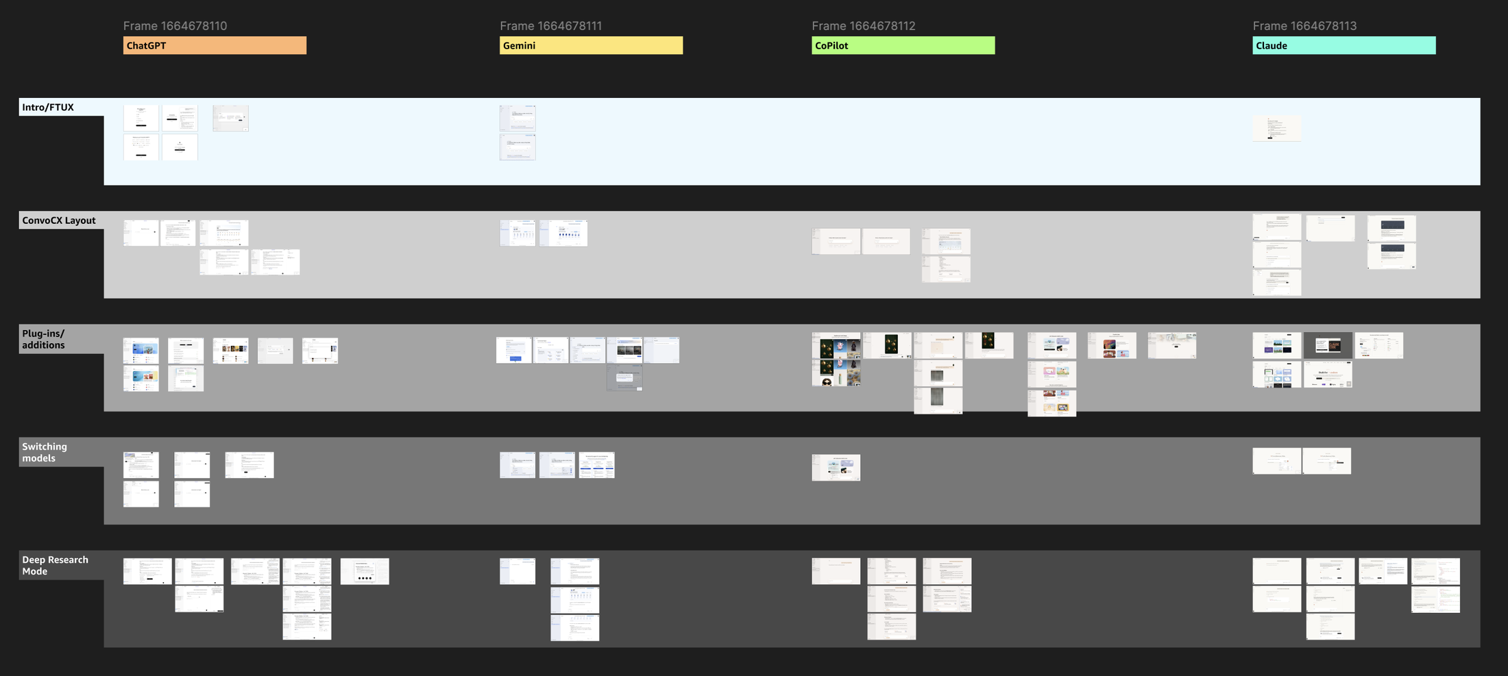
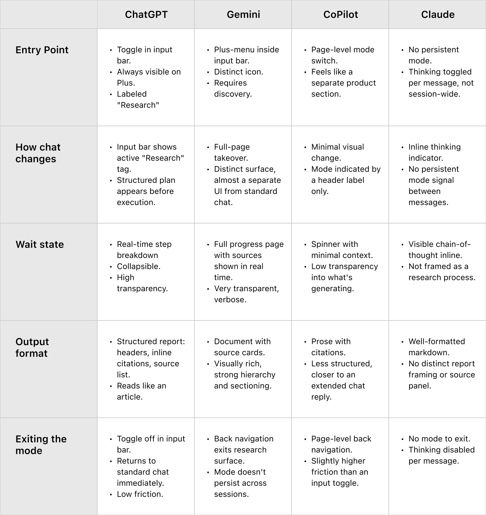
Before touching any screens, I audited ChatGPT, Gemini, CoPilot and Claude across five dimensions: entry point, how the chat changes visually, wait state behavior, output format and mode exit.
What the audit told me
The work behind the work
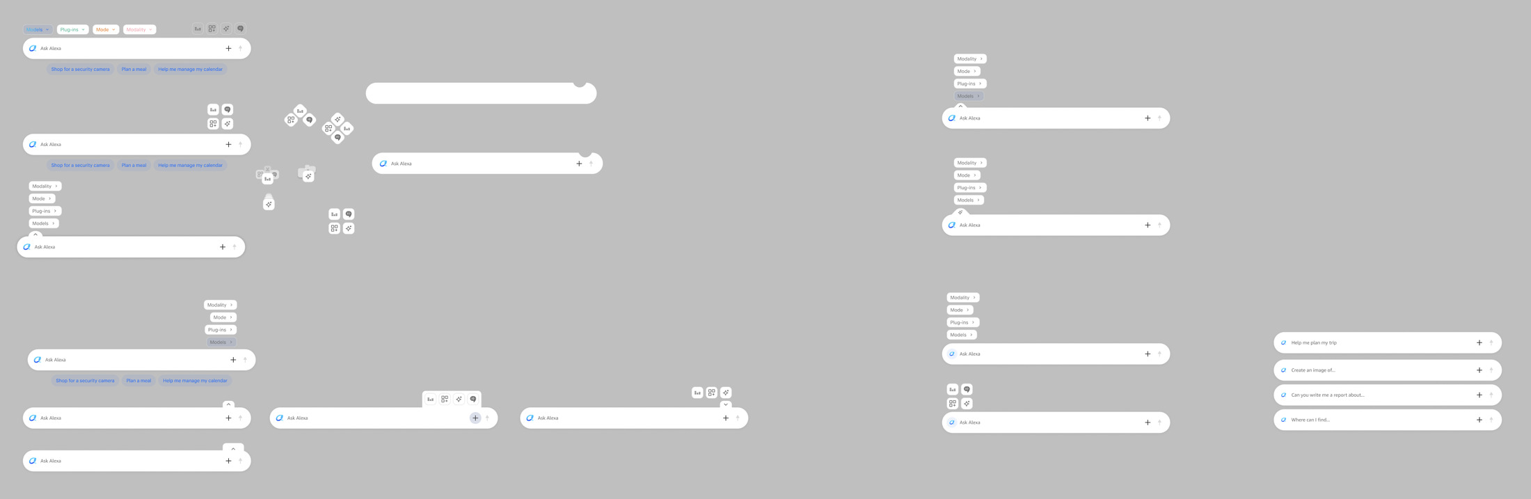
01The entry point: the '+' menu
Deep Research lives in the '+' menu of the chat bar, and shows as a removable badge once it's selected.
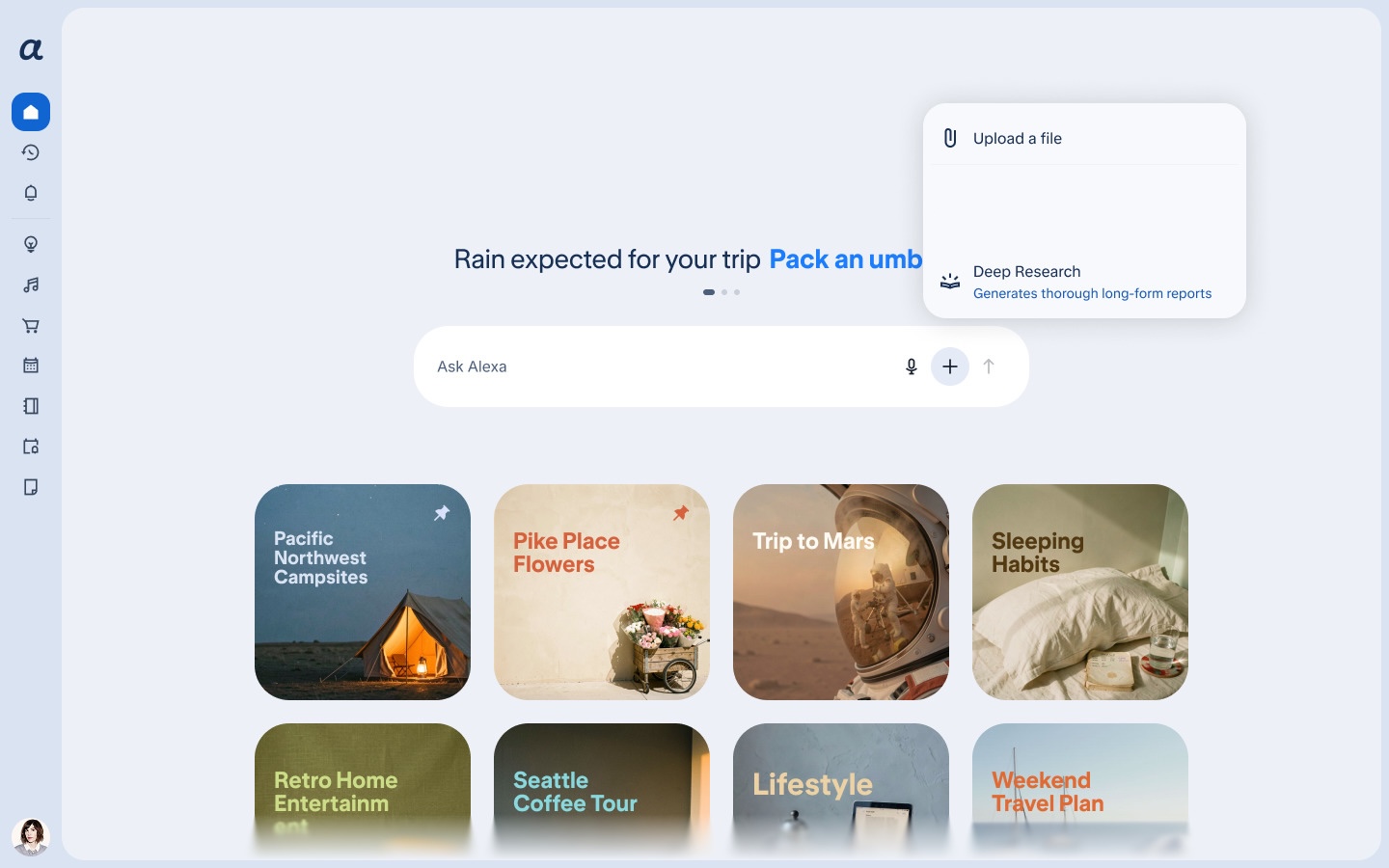
- ChallengeAn entry point that's discoverable without visual noise, and says 'this is a different mode' without complicating a chat bar that already carries a lot.
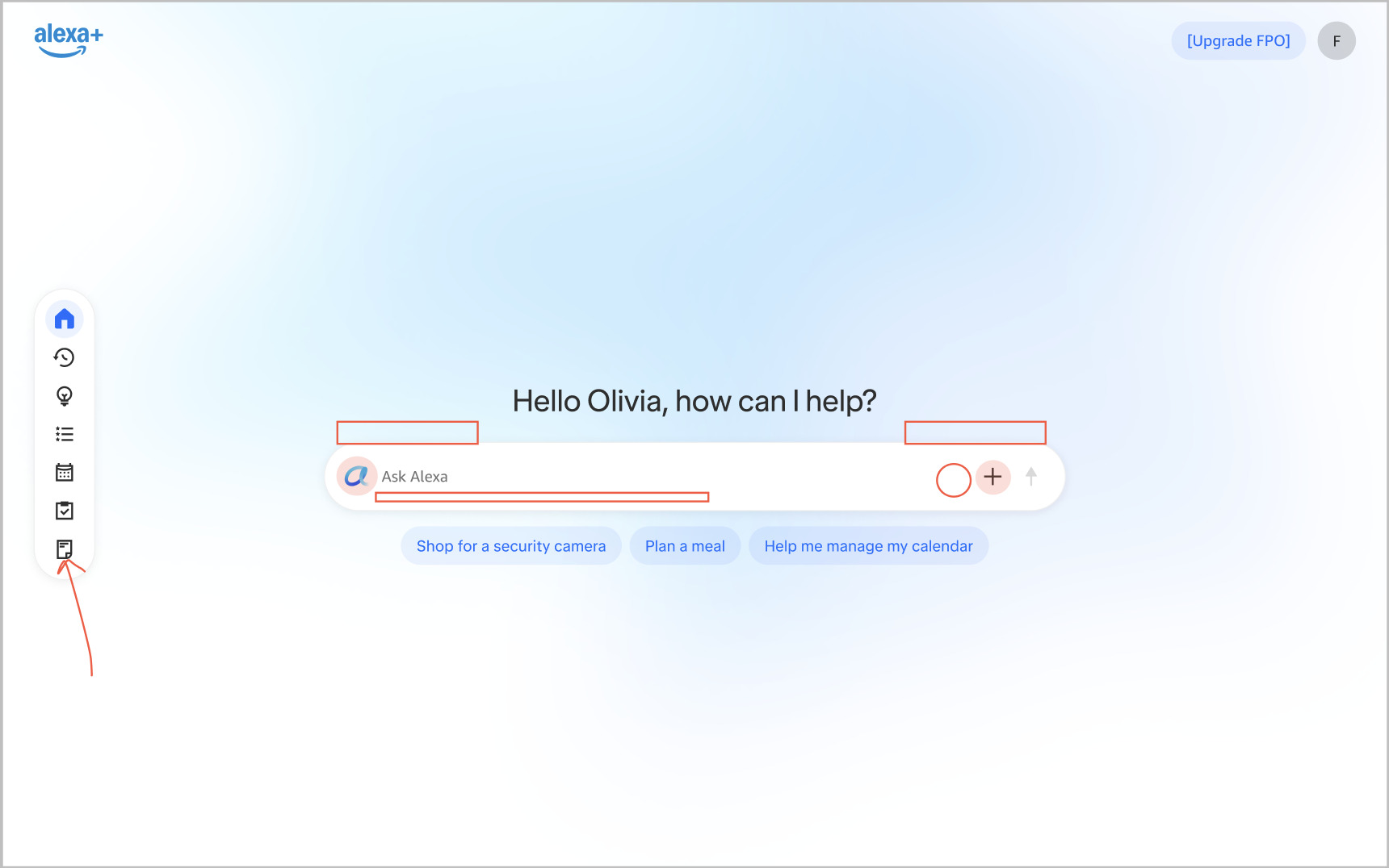
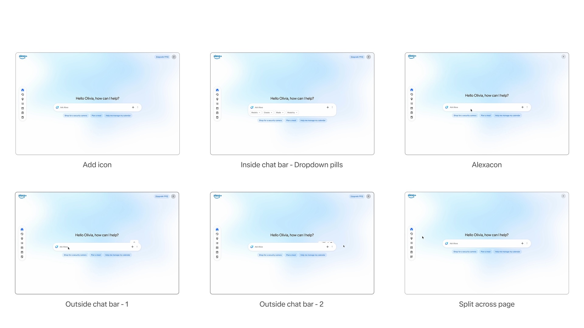
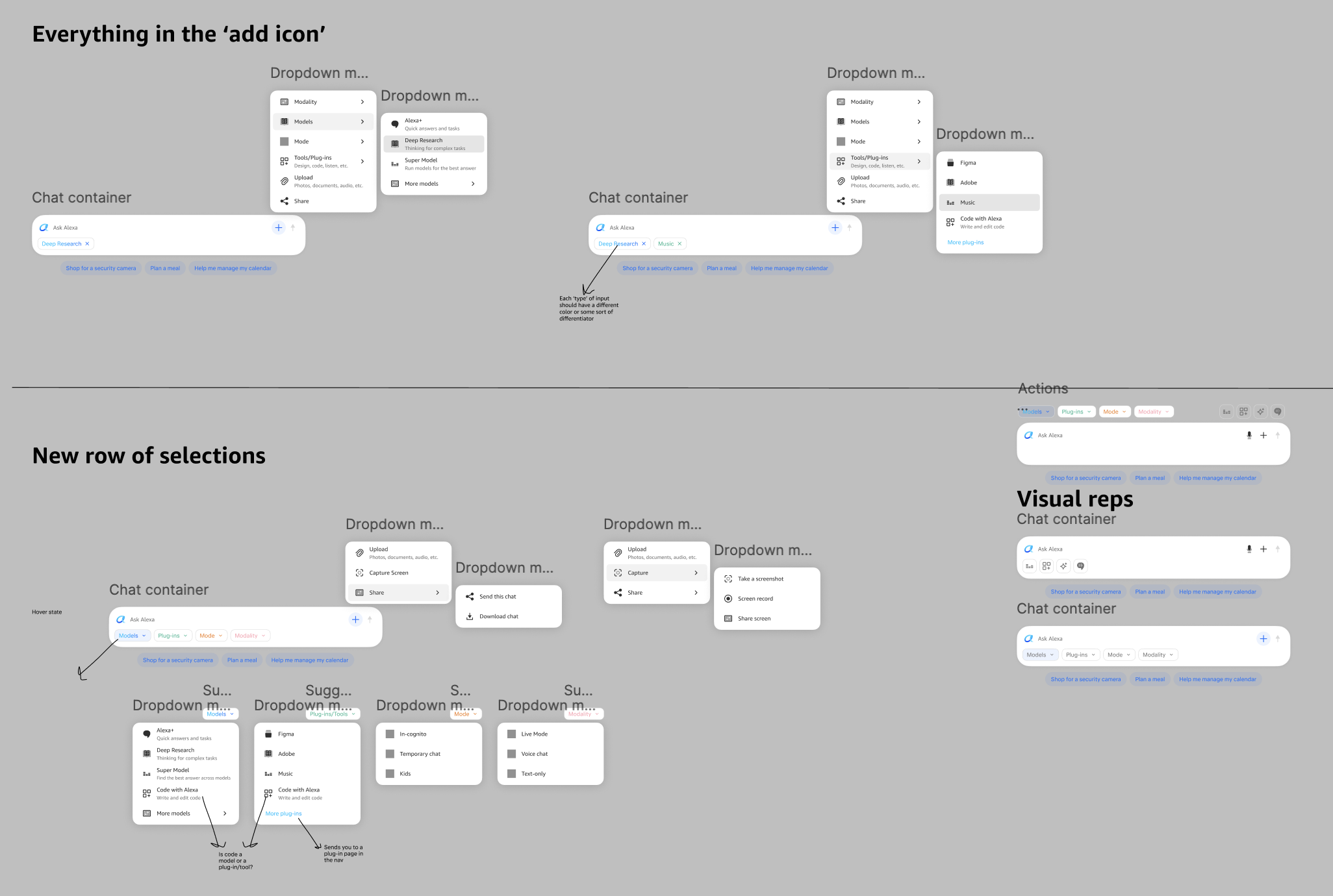
- ExplorationI looked at placement options, single-line and double-line variants, floating buttons, suggestion pills and nav bar integration, each with trade-offs around discoverability, screen real estate and conflicts with existing patterns. I built quick prototypes in Kiro and Figma to find holes in my thinking. Because this element can make or break discovery, I deliberately moved past the design system for custom components and layouts.
- ShippedThe ingress sits under the '+' in the chat bar. Choosing it adds a removable badge that stays until the customer clicks the x or turns the mode off through the '+' menu.
- BetaAbout 1 in 3 couldn't find the mode at all, and about 2 in 3 didn't find it easily. Many read '+' as 'attach a file'.“I looked throughout the interface. In most AIs, the + is to add files or information.”
While the initial results raise alarm about discoverability, I don't think they call for a change yet.
The Beta test experience was broken and inconsistent, with the '+' missing on some surfaces, and that could have been the driving part of this result. This may also be an education moment, where we teach users rather than scramble for a new ingress. I believe a second round of testing with these issues fixed is necessary to make a drastic change. For now, I'd keep the '+' for three reasons:
- ScalesIt gives new features a home. If we moved away from it, we'd have no other path for them.
- SimplerIt reduces the height of the chat ingress and stays consistent across endpoints, which also makes it easier to learn and discover over the long term.
- FamiliarIt matches how Claude and Gemini do it, so customers arrive with a mental model they already know.
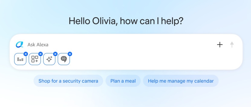
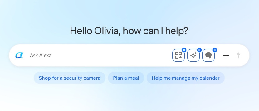
02The chat bar as a status system
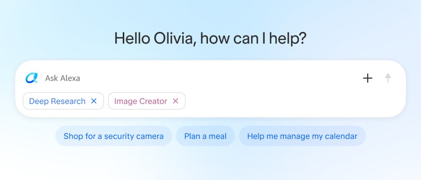
Active modes appear as badges directly on the chat bar, so the pattern scales as capabilities are added.
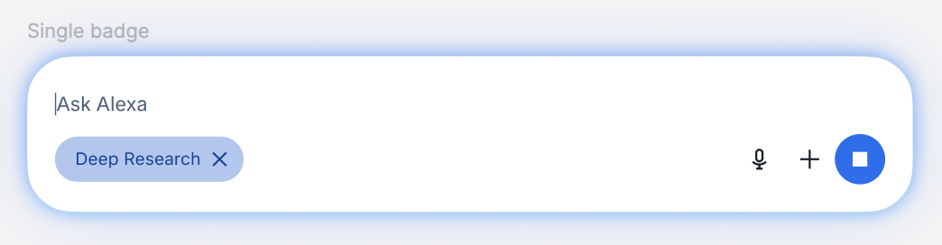
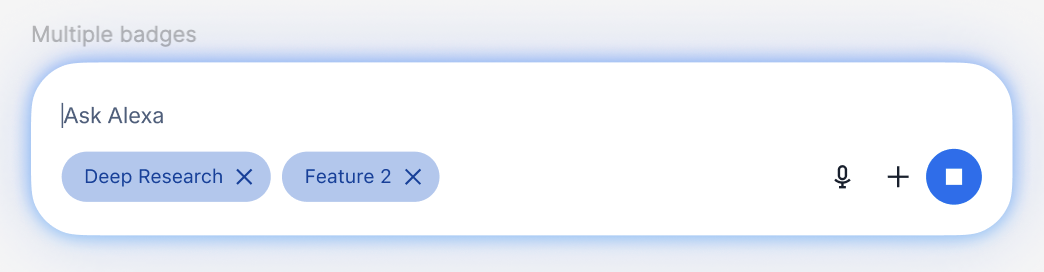
- QuestionHow can one chat bar show several active states, like Deep Research, model selection and plug-ins, without becoming cluttered?
- DecisionTreat it as an extensible status system, not a one-off toggle, so no new design solution is needed each time.
- ShippedThe badge appears when Deep Research is selected and stays until it's removed. Badges sit side by side, not stacked vertically, and there is a pattern for more than one badge.
03Making a multi-minute wait feel intentional
Deep Research can take several minutes, so customers can watch the work, or skip the wait entirely by multi-tasking.
- ShippedWhen research starts, Alexa says it has begun, that it will take time, and that a notification will be sent when it's done. The notification goes to the mobile app automatically, whatever platform the chat started on. There is no in-app banner or toast, and no 'Notify me' prompt.
- BetaOver 90% of people who got the notification reached the report with little or no difficulty. But about 1 in 3 never got one, and 'may take a moment' undersold a 10 to 20 minute wait.“Never got the push notifications and I made sure they were turned on.”“All it said was this MAY take a MOMENT. That to me indicates it might be quick when that is not the case.”
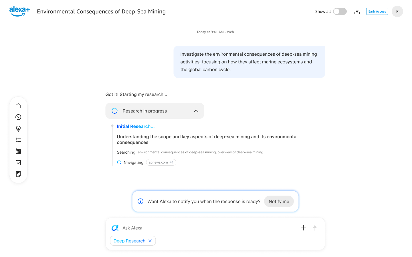
04A collapsible pill, not inline steps
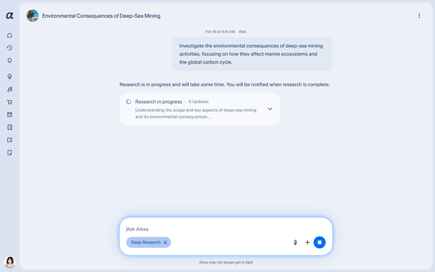
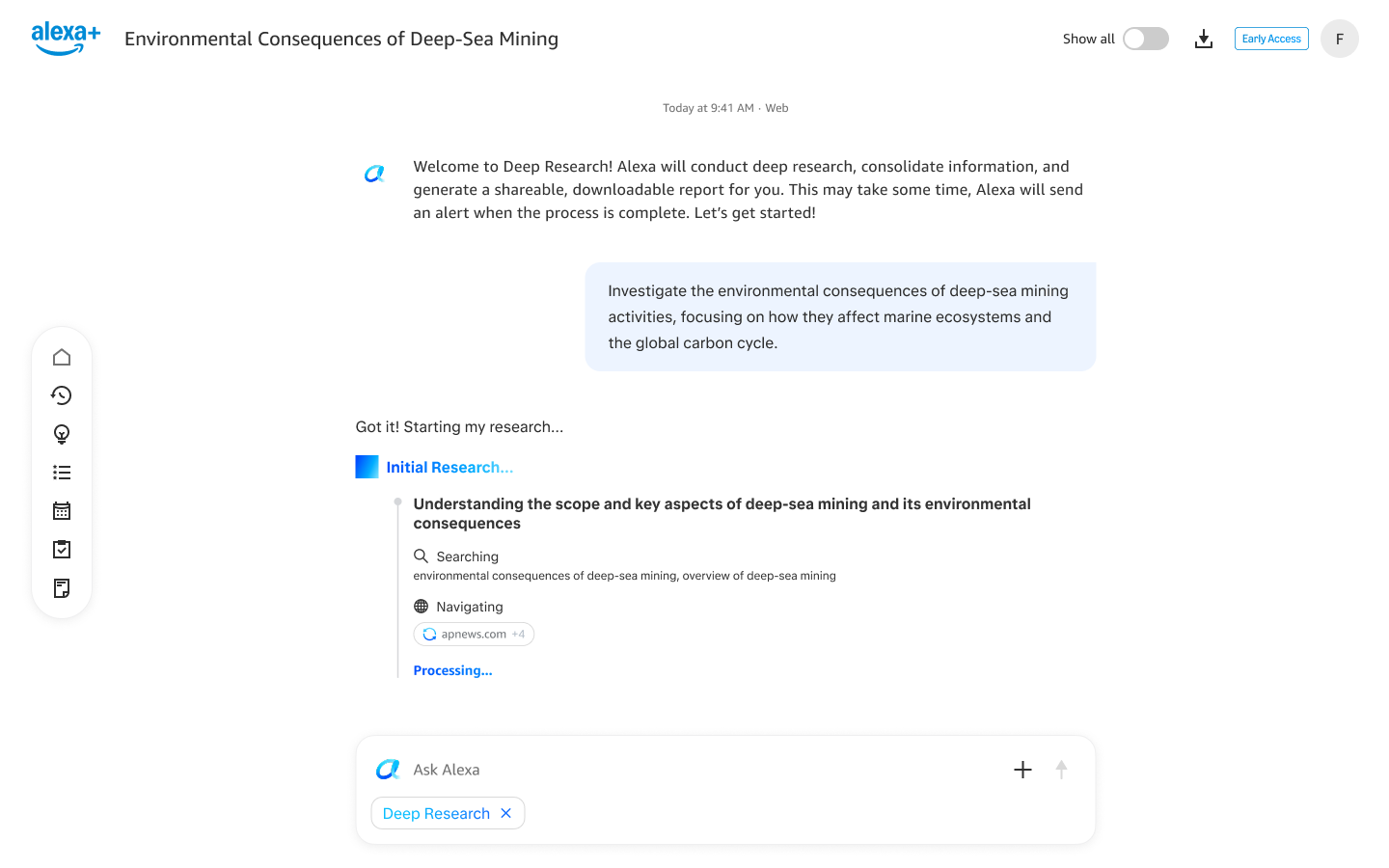
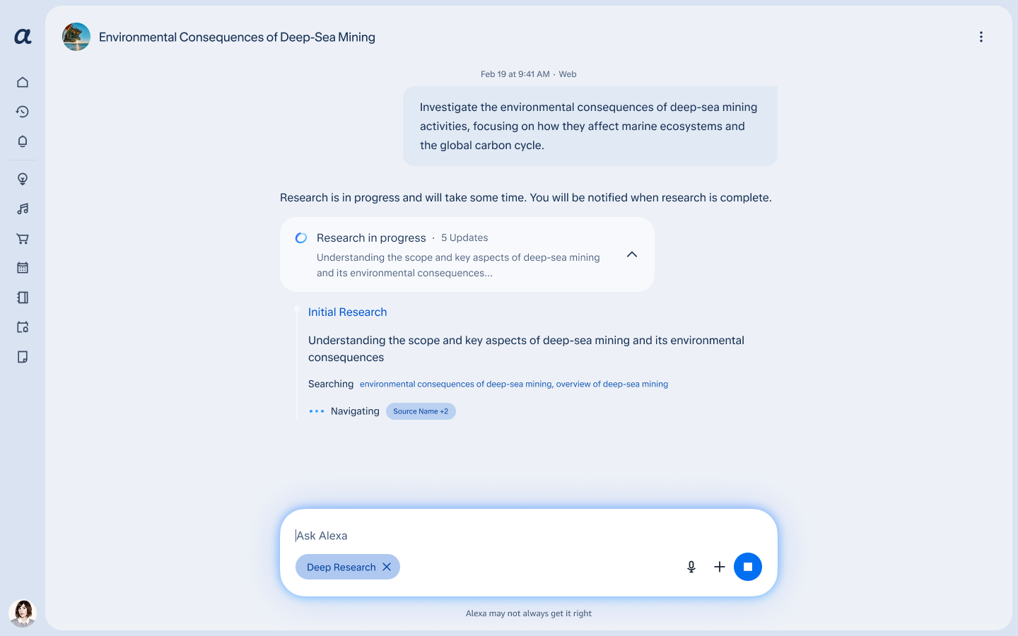
The research process lives in a collapsible pill, so the report stays the main content in chat.
- DirectionProduct wanted every step and source inline in the chat, because the data was available.
- PushbackAvailable information and useful information are not the same thing. A user planning a family trip to Hawaii doesn't need 40 lines of agent process before they see the itinerary.
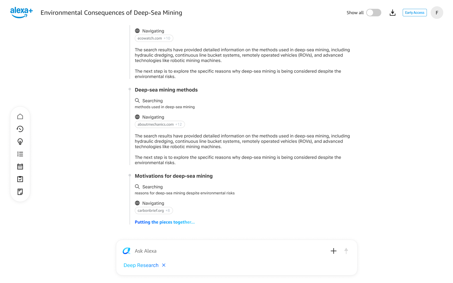
- ResolutionA collapsible pill. Collapsed, it shows the latest update. Expanded, it shows each step the agent takes in real time including any sources used, in the model's own words with no subheadings. It stays after the report is done, so the full process is still there for the customer to review or track down specific information. Waiting becomes witnessing, which lowers the perceived wait.
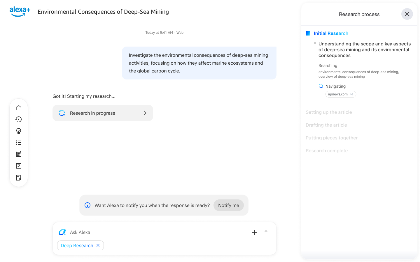
- Additional solutionsI also designed a side panel to hold the research process instead of a pill. This also allows the product to outline research to be done, letting the customer track where they are in the process, as well as what research is being conducted. While this was well-liked, backend complexity and scope pushed this to a later date.>
- BetaOver 90% could see real-time updates, and the experience scored over 6 out of 7 for keeping people informed. “It was clear what tasks Alexa was executing to conduct research.”
05The report as a document, not a response
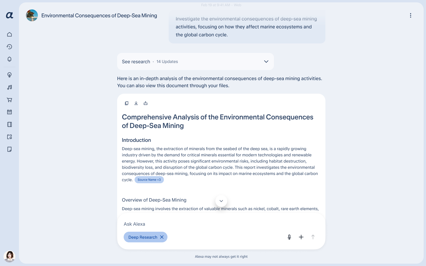
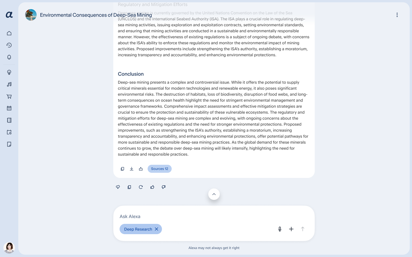
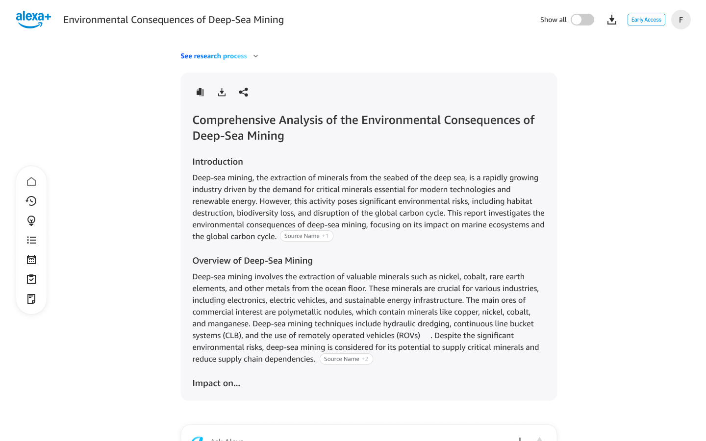
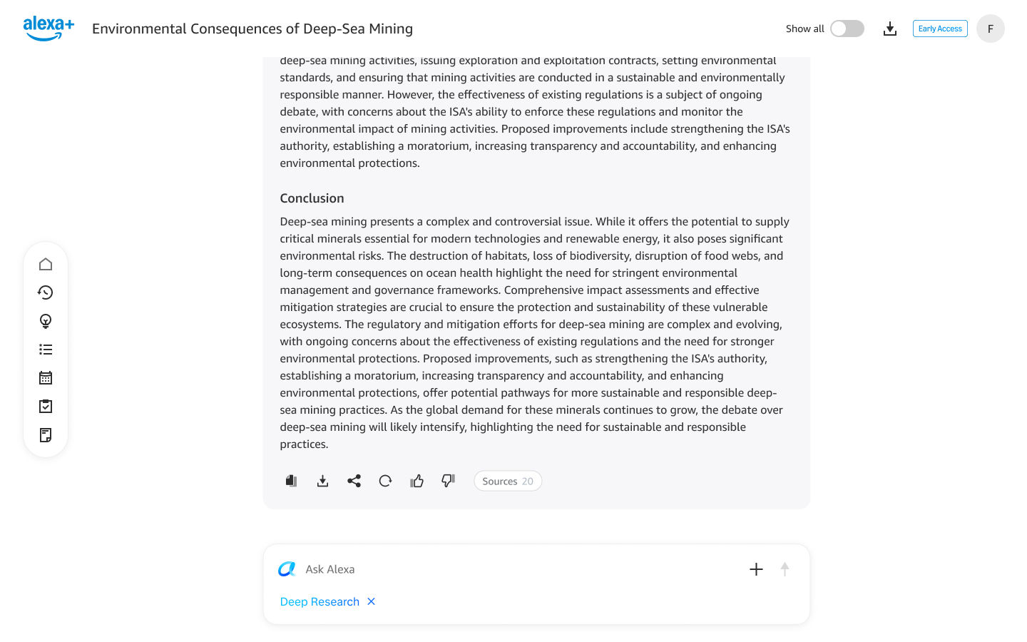
The report is a visually separate object, in a bounding box with a different colored background, so it reads as a document and not a response.
- BaselineNova rendered the report in the chat as a long scrollable output, indistinguishable from a normal Alexa response, with no sign it was a distinct, downloadable, shareable artifact.
- ShippedOne long scrollable document in a bounding box, with sources and download options. Copy, download and share sit at the top and bottom for convenience, with chat actions at the bottom. When the answer is generated, a response before the document introduces it and says where to find it in the user's Files.
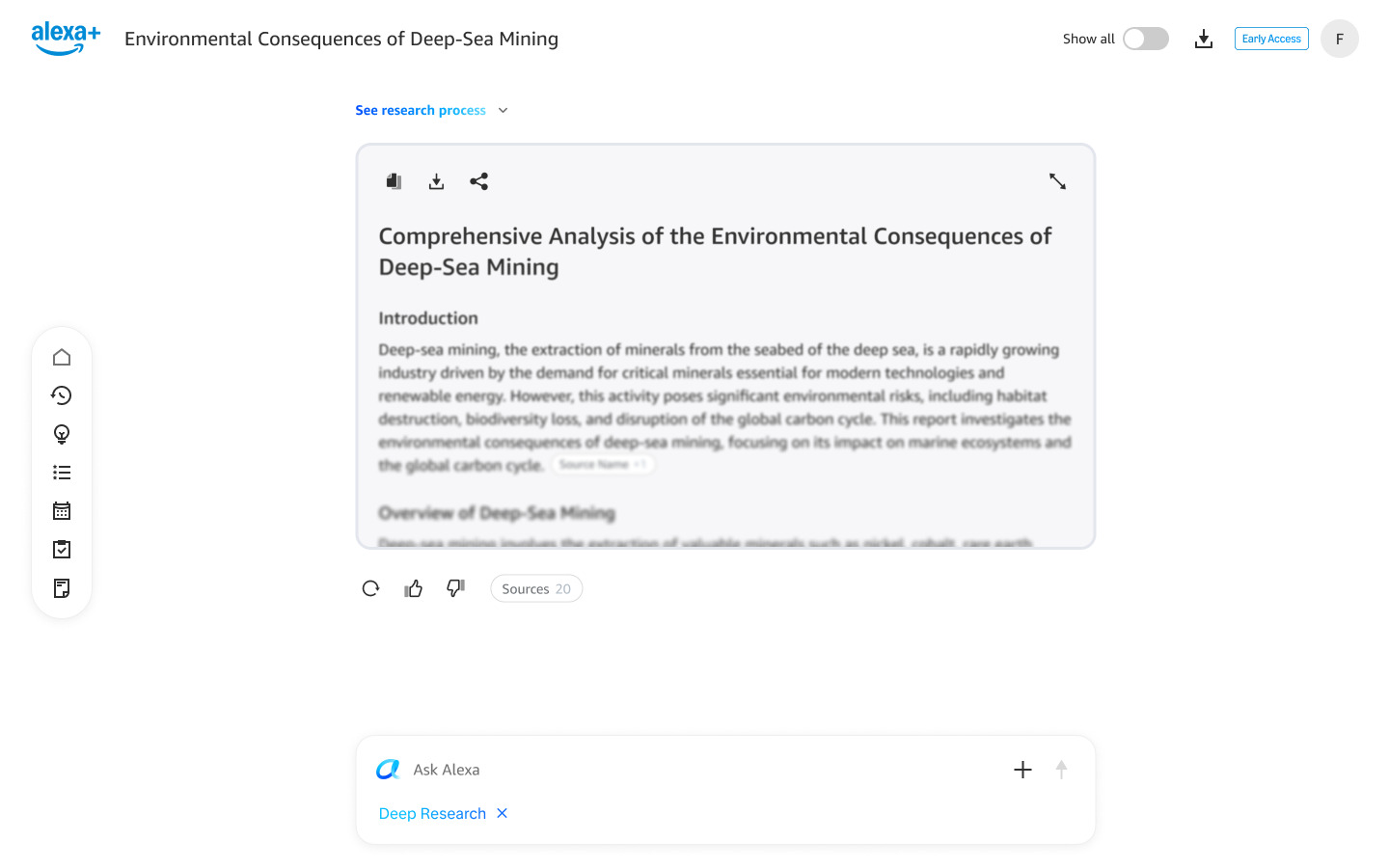
- NextWhile a bounded document artifact was an improvement from Nova's inline output, it could become a very long, tedious document since the length of the document differed from query to query, and is unpredictable. To combat this ambiguity and keep the interface clean, I suggested a collapsed version, which fades after a few lines and expands on tap. This is designed and in the pipeline.
- BetaAbout 70% rated the report better than they expected. Downloads are TXT only, and PDF and email delivery were the top requests.“It was very comprehensive, not to be compared to regular quick answers from Alexa.”“…almost like a research paper for school, which made each section flow into the next; super easy to read and navigate.”
Shipped
In the pipeline: collapsed version
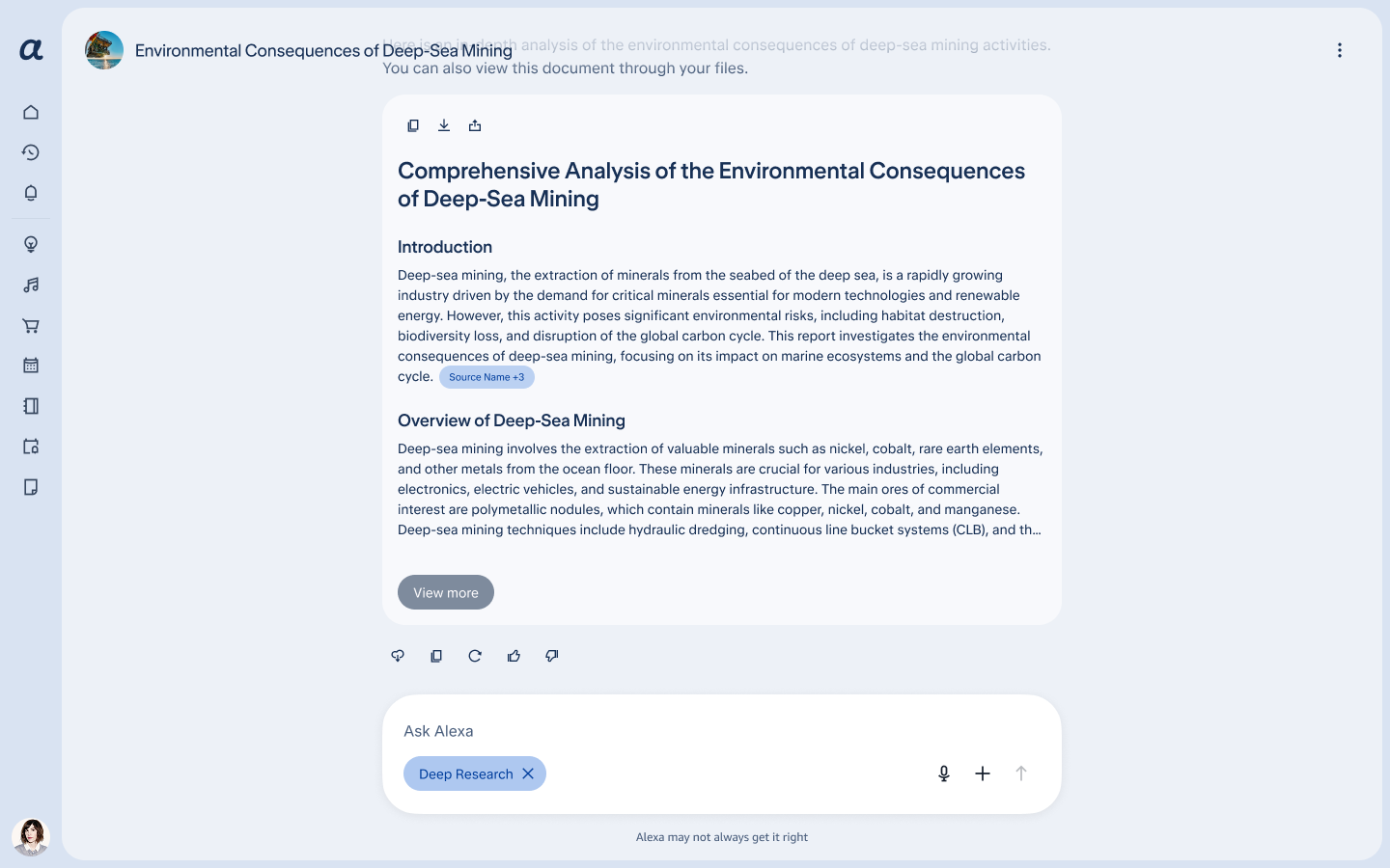
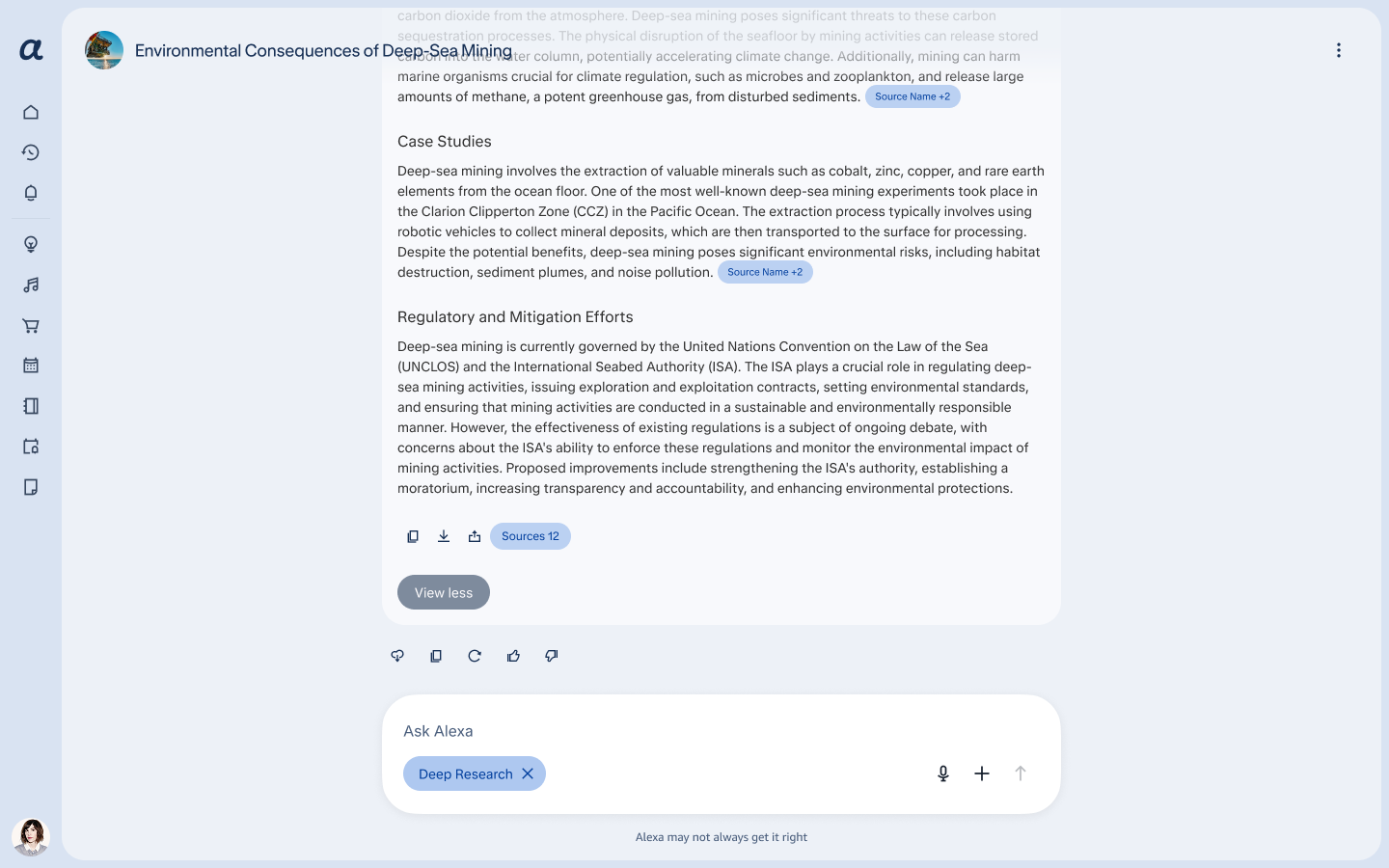
Initial explorations of the collapsed version
From '+' to report
The end-to-end flow on web, from the '+' menu to the finished report.
Where it stands
Currently, Deep Research is undergoing a second round of testing for the web version.
- PlatformIt is only developed for Alexa+ web at the moment but Mobile app is also in the works. The currently mobile experience is a view-only report, and continuing a Deep Research chat with standard conversation capabilities.
- My roleSince spec work is handed off to engineering, I test the product to ensure the design is to spec and the interaction is as intended. I also work with engineers to solve problems with interaction failures, or when something initially aligned on proves not feasible.
- ScopeA visual system change extended the project from 6 months to a year. I worked with visual designers to ensure interaction was not lost or misinterpreted due to this change in components, layouts, text styles, etc.
-
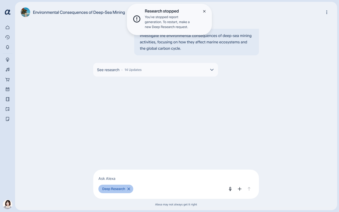
Edge cases
Errors, timeouts, failures and customer intervention show an actionable toast, so customers can
choose their next step. If a request is too vague, the model asks follow-up questions before it begins
generating.
Stopping the research shows a toast that tells customers what to do next
- EditingReal-time editing works: follow-up edit requests are taken and applied correctly.
Initial Results
One round of Beta testing with about 65 customers, some of them internal employees, run by the product team. This tested the feature, not the design. While first round results are promising, a second round is slated to make sure we catch any other issues before launch.
First-round Beta feedback:
What's next
Beta testing shaped what needs attention and comes next:
- Find itEducate customers on where the mode lives on their first session after launch, including new customers. Fix the in-product guidance too: Alexa pointed some people to settings that don't exist.
- The reportDevelop and ship a collapsed version, and add PDF export and 'email me the report', maybe as a pill customers can tap.
- ExpectationsReplace 'may take a moment' with something realistic about the wait time.
- Re-entryDevelop and ship long running activity bars that float at the top of the screen during a long task, alert the user when it's done, then disappear.
What I'd carry forward
- Education or ingressThe open question from Beta is discoverability: about 1 in 3 people didn't find the mode. '+' reads as 'attach a file' to many people. Round two should show whether that calls for a new entry point or for educating customers how to access new features.
- Honest waits'May take a moment' undersold a 10-20 minute wait. Setting honest expectations matters as much as showing progress and builds trust with the customer.
- Feature or designBeta was a feature test, not a design test. It showed where things break, not always why. A design research-forward test may be more informative about the overall interaction issues and mental model differences.
This project is pre-launch and confidential.