Alexa+
Citations Design
Feature Design and Visual Strategy
Launched
Problem
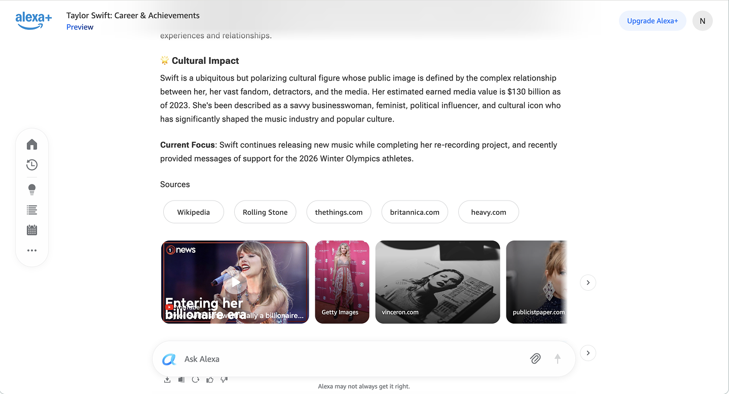
Citations are meant to build trust, but Alexa’s existing system was doing the opposite. Responses relied on large, interactive citation pills in the middle of content, sometimes drawing more attention than the response itself. They interrupted reading flow, consumed valuable screen space, and mixed up the distinction between the answer, sources, and suggestion pills after a response. Placing citations after every relevant sentence dramatically increased cognitive load and visual noise.
Solution
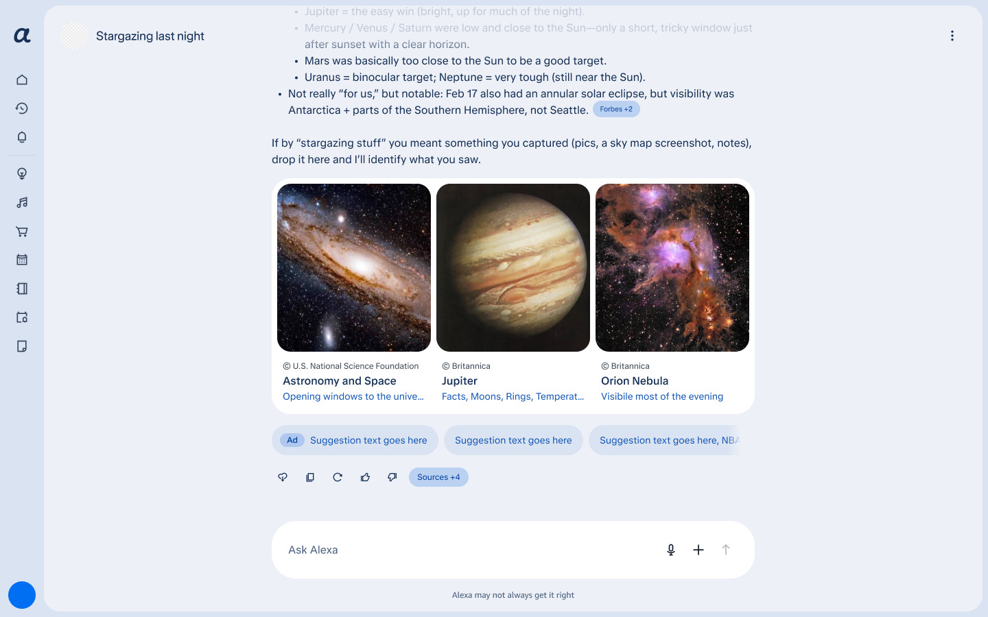
The solution was to decouple trust from interruption. Instead of forcing source pop-ups per sentence, I shifted to a paragraph-level grouped citation, blending with other interactive elements in chat and continuing reading flow. A centralized Sources panel allowed users to view all the sources in a response on their own terms. This solution on the web experience led to easier scanning, less clutter, and higher perceived trust in pre-launch results.
Research and Insights
I conducted a self-audit, customer interviews and surveys with the help of our research team, and competitive analysis for evaluation.
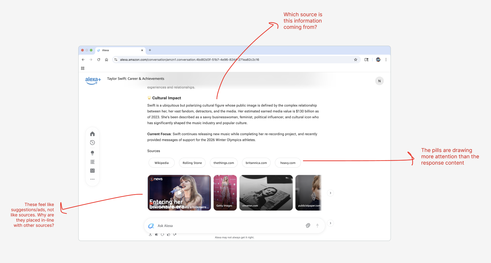
The initial self-audit suggested issues like:
- Vague and unintuitive links between content and its source
- Unintentional emphasis on sources rather than on the response content
- Lack of distinction between different types of content provided within a response (answer, suggestions, sources, etc.)
Key insights from customer research included:
I identified two primary audiences:
Across personas, the friction was the same: users wanted control over when they engaged with citations.
Design and Impact
Final Solution
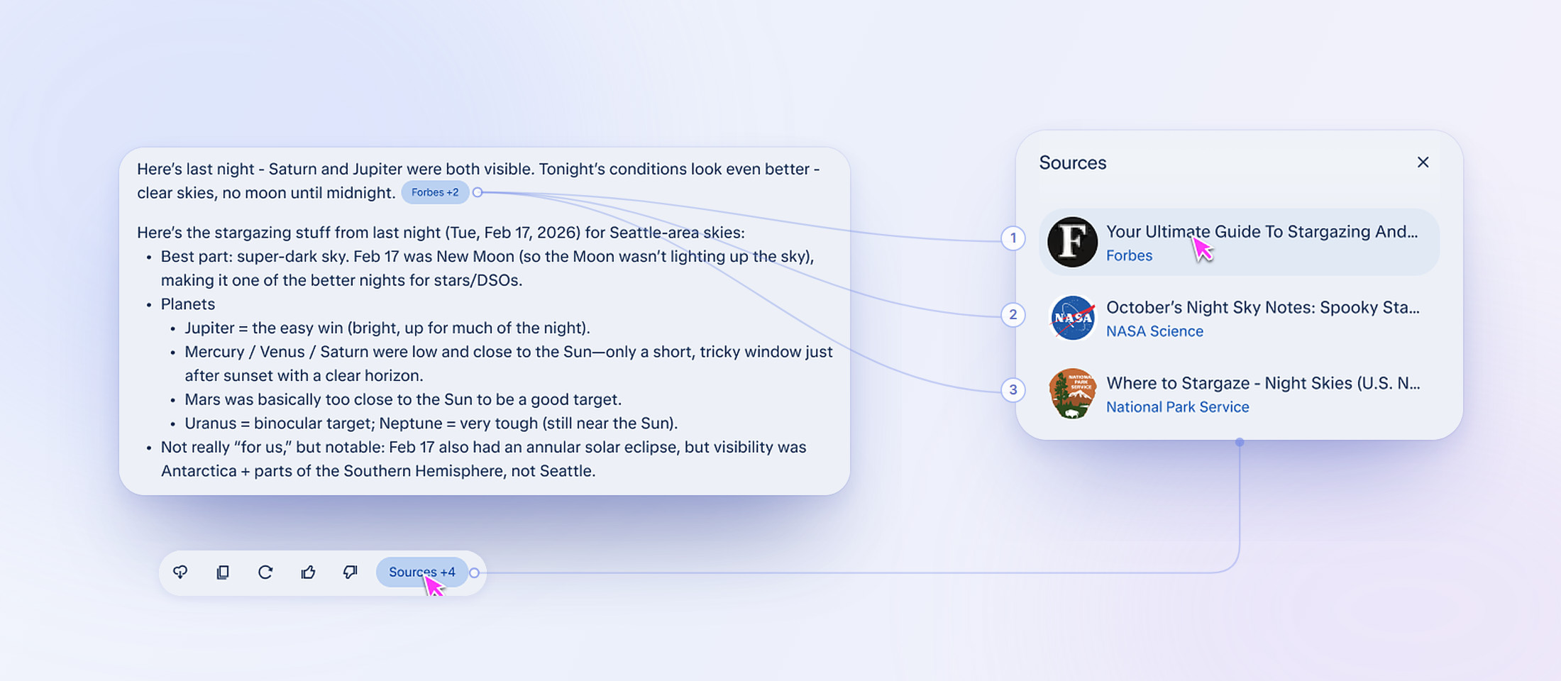
The final system centers on two lightweight entry points to source information:
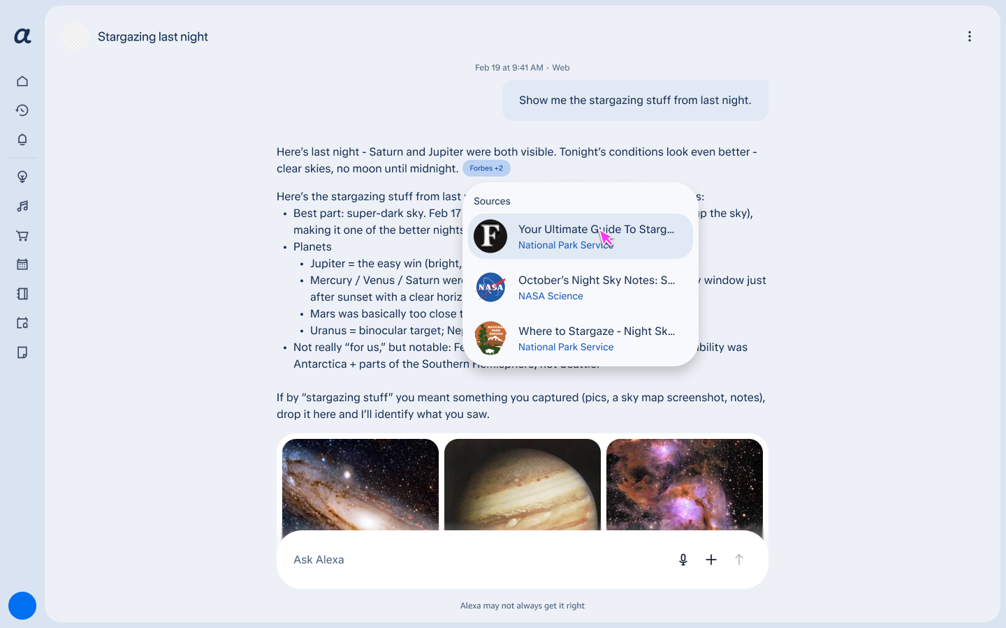
1In-line Citations
Citations appear at the end of relevant paragraphs and are visually minimized through truncation. On hover (only on Web), they expand to reveal the full source name, URL, and logo when available.
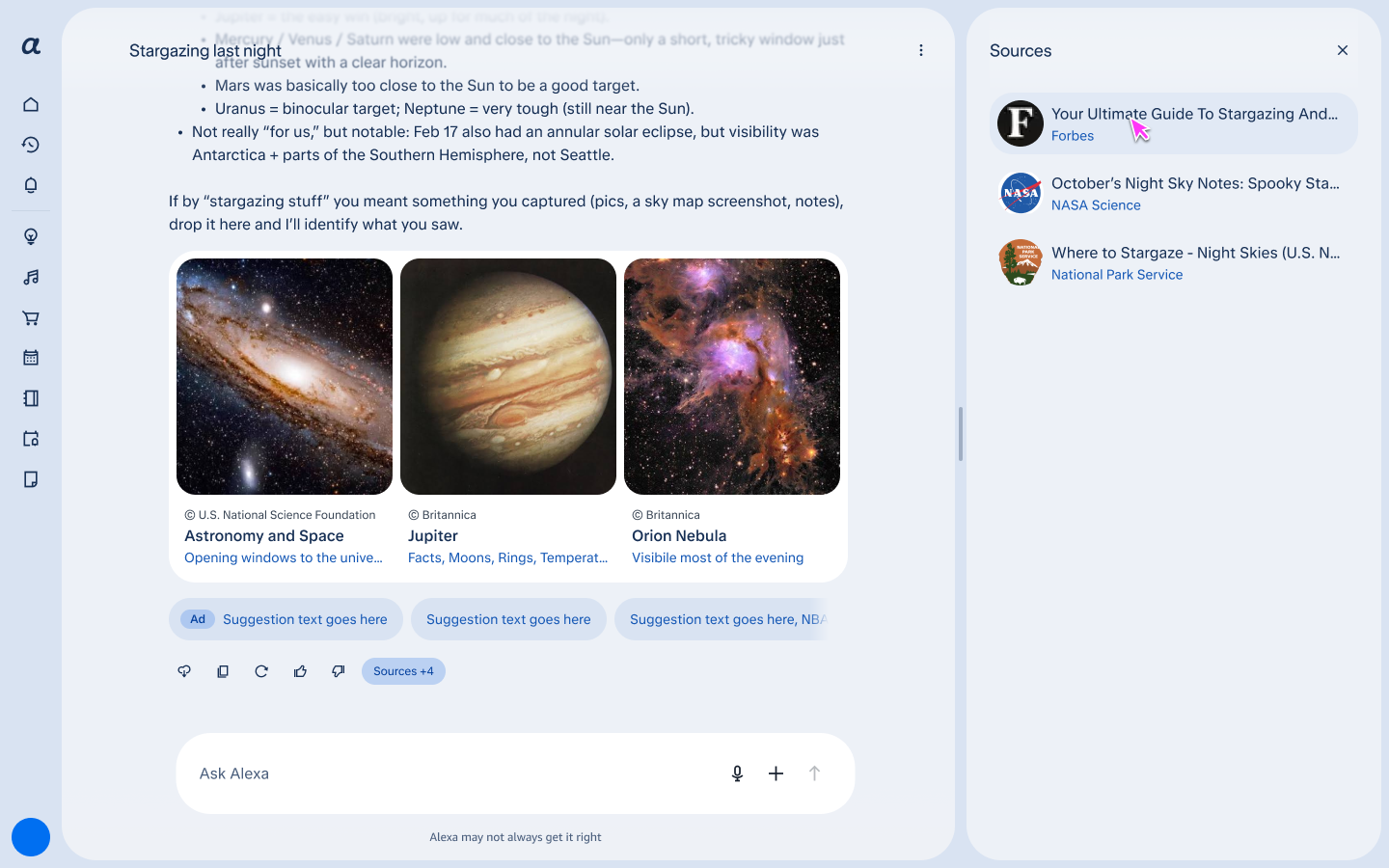
2Sources Panel
A persistent “Sources” button opens a side panel listing all sources from a response in one place, allowing users to explore references without interrupting the reading experience.
Impact
Internal usability testing showed that paragraph-level citations improved scanning ability and reduced visual clutter. Users understood the Sources button as a single entry point for trust, and performance benchmarks confirmed that citation rendering did not slow content delivery.
Pre-launch results indicated:
- Higher perceived trust in responses
- Smoother reading flow
- Clearer access to sources
- Strong alignment across mobile and web teams
Instrumentation was added to track citation impressions, engagement, and load times post-launch.
Reach out for more!